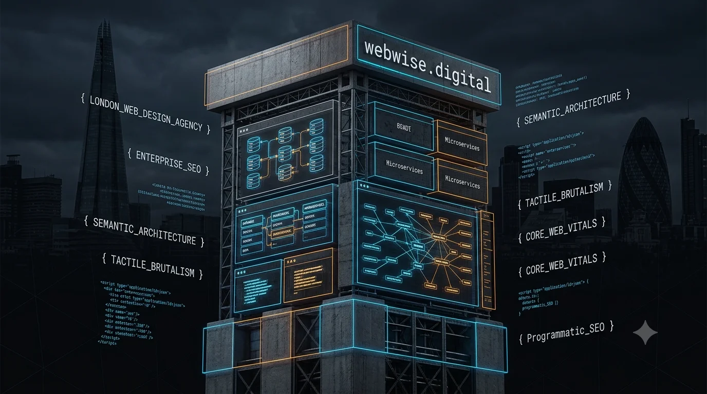
To compete in the hyper-saturated 2026 digital ecosystem, businesses must pivot from standard corporate interfaces to high-performance, entity-driven web architectures. This comprehensive technical guide dissects how a premier london web design agency utilizes tactile brutalism, micro-animations, kinetic typography, and programmatic SEO schema to capture dominating market share and convert organic traffic at an enterprise scale.
Chapter 1: The New Paradigm of the London Web Design Market in 2026
The commercial landscape for digital visibility has never been more aggressively contested. The London SEO and web design landscape in 2026 is highly concentrated; of the 828 UK agencies indexed, 322 operate strictly within London, making it the most heavily populated digital sector in the country. Securing page-one rankings requires more than standard keyword mapping; it demands total synergy between advanced frontend engineering and deep semantic structuring.
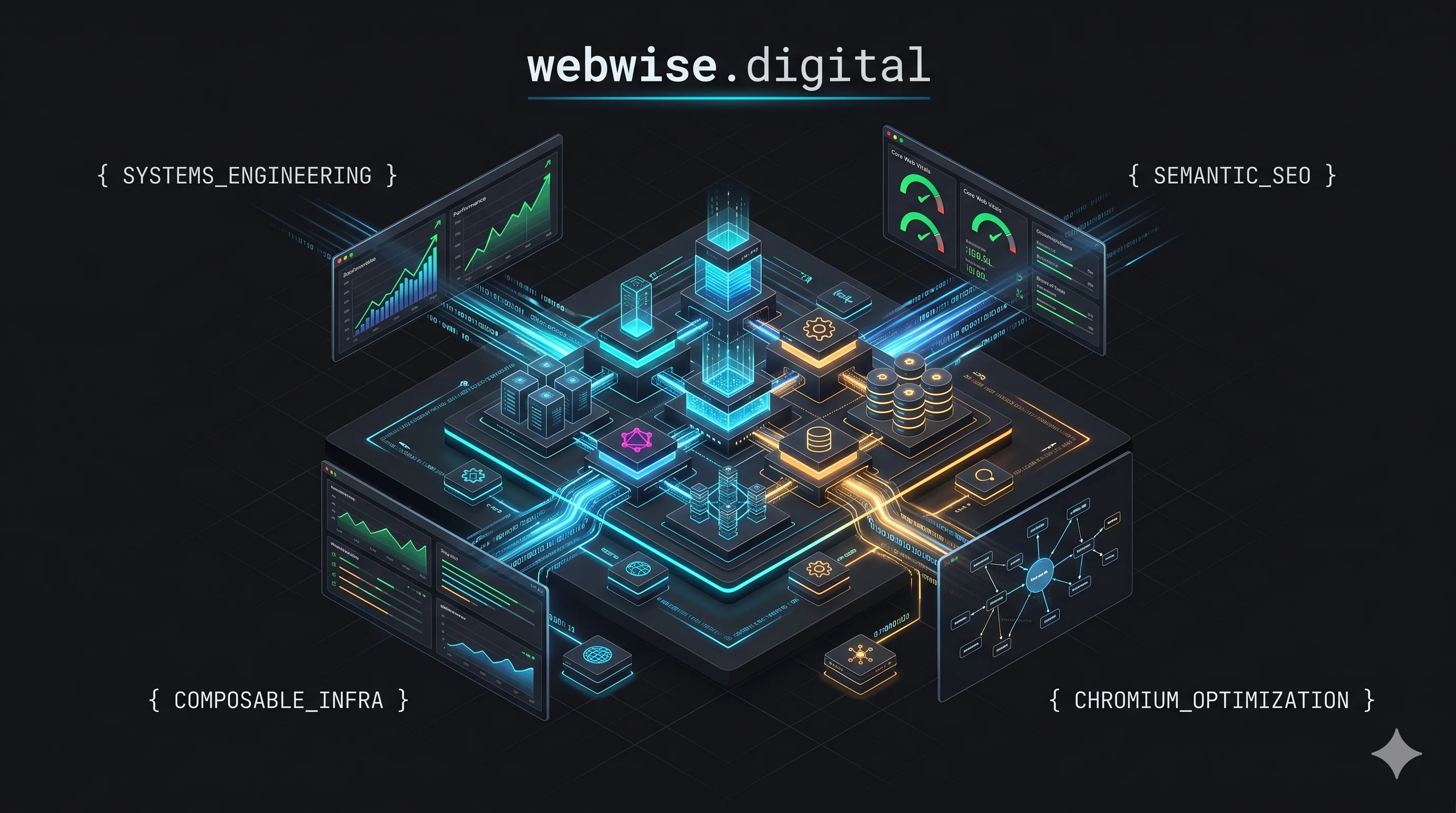
A premier london web design agency does not simply build websites; they engineer autonomous data delivery systems. Search engines evaluate platforms via Chromium-based headless browsers, scrutinizing Time to First Byte (TTFB), Interaction to Next Paint (INP), and semantic entity connections. To survive in this market, digital platforms must abandon bloated legacy codebases and embrace composable architectures that load instantaneously on global edge networks.
Chapter 2: The Eradication of Soft UI and the Rise of Tactile Brutalism
The corporate soft UI aesthetic that defined the early 2020s—characterized by heavy drop shadows, extreme border radii, and floating components—is being rapidly phased out by elite user interface teams. In its place, the industry is aggressively adopting tactile brutalism.
This aesthetic rejects the illusion of floating, weightless elements in favor of a brutalist approach where interface components feel physical and precisely engineered. By executing this shift, deploying frameworks through webwise digital provides a massive visual contrast against the homogenous, perfectly polished outputs of standard AI site builders.
The Core Mechanics of Tactile Brutalism
Explicit Container Definitions: Modern layouts rely on aggressive, sharp geometry.
Zero Drop Shadow Design: The industry is seeing an abandonment of 8px rounded corners in favor of stark 0px right angles and flat, pill-shaped buttons.
Structural Wireframing: Interface containers, interactive cards, and navigation bars are distinctly separated using explicit 1px solid CSS borders. These borders—typically neon or stark white against dark-mode backgrounds—create a highly structured wireframe aesthetic.
Chapter 3: Engineering Sensation Through Mathematical Code
Depth is no longer faked through blur. Heavy image payloads that destroy mobile performance scores are being stripped out completely. Instead, high-performance web design utilizes mathematics and clean CSS to create physical sensations on the screen.
An elite web design agency london achieves this by applying CSS noise and film grain. By overlaying a subtle CSS grain filter or an animated SVG noise layer onto a solid background, developers can instantly break up the perfection of the digital canvas. This approach provides a rich, tactile quality resembling printed paper or cinematic film, without adding the heavy bandwidth tax of high-resolution background photography. Static gradients are considered entirely obsolete, replaced by dynamic, mathematically generated backgrounds.
Chapter 4: Responsive 3D and the Evolution of Micro-Delight
While brutalism handles the structural foundation, user retention is secured through elite motion engineering. 3D elements on the web used to serve merely as heavy, slow-loading decoration. Now, they function as dynamic conversations between the user and the interface.
By leveraging lightweight frameworks such as Spline and React Three Fiber, modern development teams can build responsive 3D environments that tilt, move, and react intuitively to user scroll and cursor inputs.
Furthermore, standard UI movements are maturing into what the industry terms "micro delight". This focuses on the smallest interactive details: the subtle physical bounce of a conversion button, a toggle switch that feels inherently tactile, or a form field that gently reacts to a user's keystrokes. These micro-animations engineered by webwise digital bring flat designs to life without overwhelming the user or slowing down the primary rendering thread.
Chapter 5: Typography as the Primary Interface Architecture
In previous development cycles, typography acted as a secondary supporting element to hero photography. In 2026, it has been elevated to serve as the primary interface architecture. This shift serves a dual purpose: fulfilling an aesthetic desire for editorial boldness while enforcing an engineering mandate to severely reduce page payload weight.
When evaluating a premier london web design agency for enterprise deployment, their typographical execution separates the elite from the standard.
Advanced Typographical Deployment Strategies
Strategic Vector | Implementation Method | Performance Impact |
Viewport Scaling | Utilizing vw (viewport width) typography ensures a single target word stretches flawlessly from the absolute left edge of the screen to the right, creating immediate impact. | Eliminates layout shifting across unique mobile dimensions. |
Kinetic Manipulation | Implementing scroll-driven mapping where font weight and width respond to the user's scroll position. Letters organically compress and expand in real-time. | Increases user dwell time without heavy video assets. |
High-Contrast Pairing | Premium web experiences establish deep contrast by pairing elegant neo-serif headings with data-driven monospace utility fonts specifically for metadata and buttons. | Creates a clear visual hierarchy for search engine crawlers. |
Chapter 6: The AI-Powered Personalization Engine
Beyond the frontend aesthetics, the underlying data architecture must be intelligent. As we navigate through 2026, web environments are shifting away from static delivery toward AI-Powered Personalization.
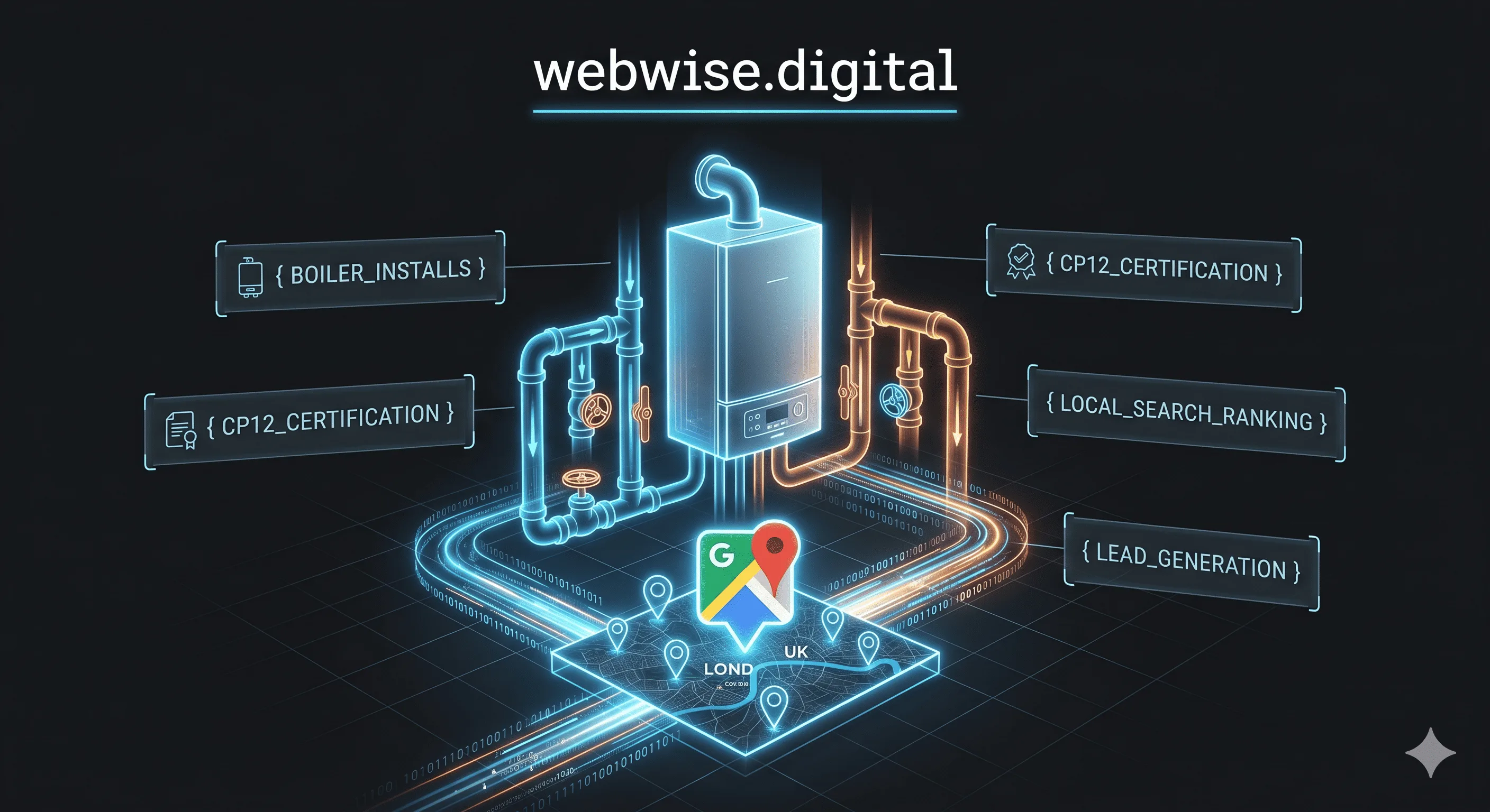
Geo-location integration has become a mandatory component, especially for commercial and e-commerce platforms. A highly optimized website dynamically alters its content, displaying specific localized language, exact regional currency, and targeted news based directly on the user's physical location.
A progressive web design agency london builds programmatic routing systems that connect these personalized frontends directly to secure, headless CMS environments. This ensures that when a user from Central London accesses the platform, they are served hyper-local case studies, precise local service offerings, and exact geo-coordinate Schema markup, signaling absolute relevance to localized search algorithms.
Chapter 7: Execution and Core Web Vitals Dominance
Aesthetics and personalization mean nothing if the Chromium rendering engine fails the site on performance. Search visibility is inextricably linked to technical speed.
To dominate the search results, every asset must be optimized:
Vector Superiority: High-resolution photography is routinely stripped out in favor of Scalable Vector Graphics (SVG) and pure CSS. This drastically reduces server bandwidth consumption and protects the Largest Contentful Paint (LCP) metric.
Dark-First Default States: Driven by the realities of modern hardware and OLED power consumption, dark mode 2.0 aesthetics are now standard practice for enterprise deployments.
Asynchronous Scripting: Deferring non-critical JavaScript until the user interacts with the page ensures that the main thread is never blocked, keeping the Interaction to Next Paint (INP) strictly under the 200-millisecond threshold.
By merging tactile brutalism with razor-sharp code, zero drop-shadow design, and edge-native server routing, platforms run on the infrastructure of webwise digital engineer systems that do not just exist on the web—they aggressively command it.