
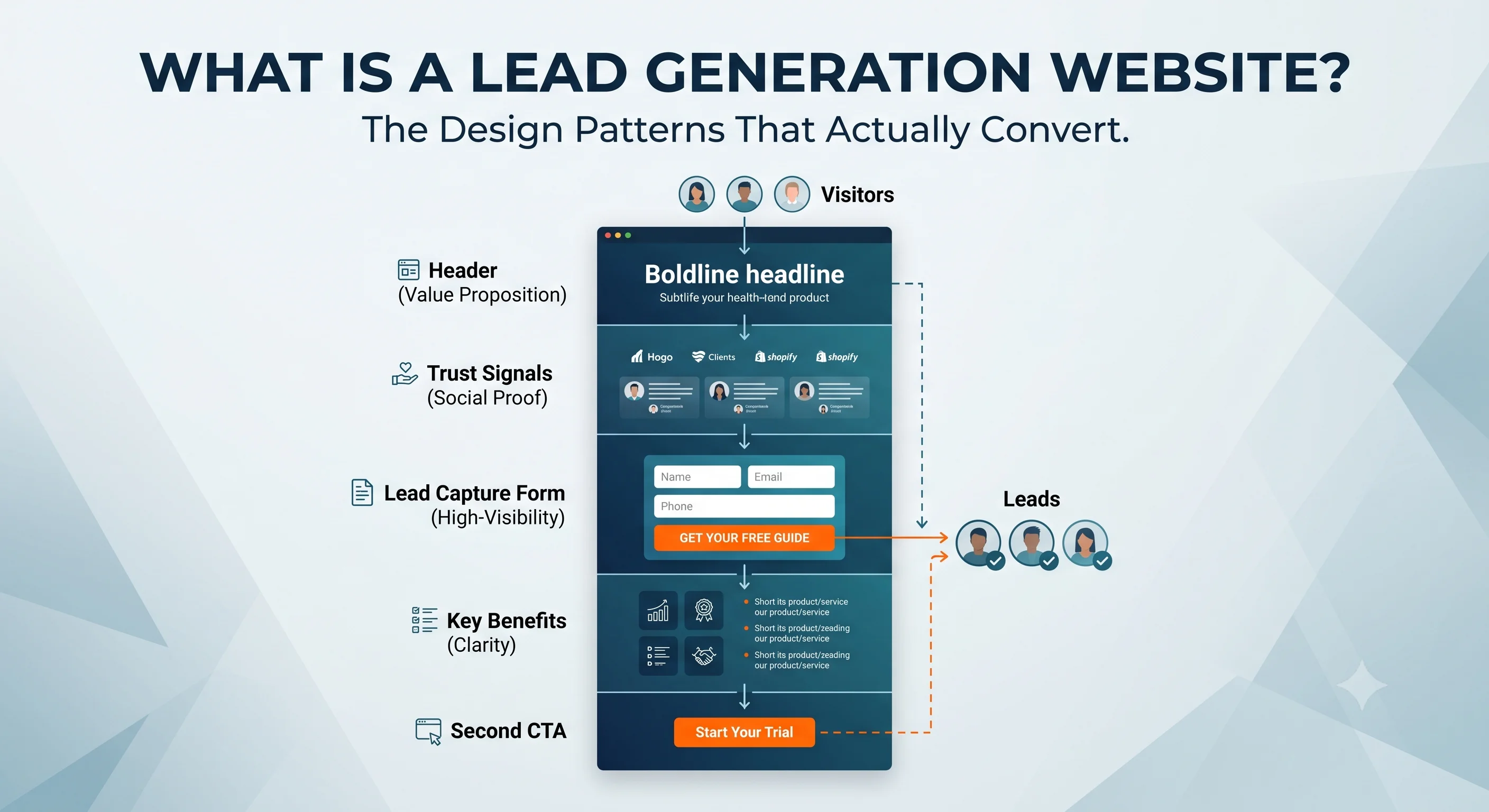
A brochure site exists to look professional. A lead generation website exists to turn a stranger into an enquiry. Most small businesses have built the first when they actually needed the second.
The phrase "lead generation website" gets used loosely, often to describe any business website with a contact form somewhere on it. That is not what the phrase actually means, and the distinction matters. A lead generation website is a specific category of site, built around a specific job: converting an anonymous visitor into a named, contactable prospect - a phone call, a form submission, or a booked consultation - as efficiently and predictably as possible. Everything else on the page exists to support that one outcome.
This is different from a brochure site, which exists primarily to inform and reassure, and different again from an e-commerce site, which exists to process a transaction directly. All three can share the same domain and the same design language, but they are solving genuinely different problems, and a site built with the wrong category in mind consistently underperforms - looking professional while generating almost nothing.
35% - reduction in form abandonment achieved by moving from a single long form to a multi-step qualification structure
200%+ - more leads generated by websites with properly optimised, benefit-led CTAs, per HubSpot research
One - the number of primary conversion goals a genuinely effective lead generation page should have - not several competing options
1. The Four-Stage Framework: Attract, Engage, Convert, Nurture
A lead generation website is best understood as a system with four connected stages, not a single page design. Attract brings the right visitor to the site in the first place - through search visibility, clear positioning, and content that matches what a genuine prospect is actually searching for, rather than generic messaging that could describe any competitor equally. Engage keeps that visitor on the page long enough to understand the offer - through page structure, credibility signals, and content that matches where they are in their decision process. Convert is the specific mechanical moment - the form, the call button, the booking widget - where interest becomes contact information. Nurture is what happens to that contact afterwards, so the lead is not simply captured and forgotten.
Most underperforming small business websites have built the Attract and Engage stages reasonably well - they look professional, load acceptably, and explain the business clearly - but have never deliberately designed the Convert stage, treating the contact form as an afterthought rather than the entire point of the page.
2. The Single-Goal Rule
The most consistent finding across current lead generation design research, and the principle we apply to every WebWise build: every page should have exactly one primary conversion goal, not several competing options presented with equal visual weight. A page offering "Call Now", "Book Online", "Download Our Brochure", and "Sign Up for Our Newsletter" with identical prominence forces the visitor to make a decision about which action to take before they have even decided whether to act at all - and the easiest response to that confusion is to do nothing.
The fix is not necessarily removing the secondary options entirely - it is establishing a clear hierarchy. One primary action, visually dominant and repeated at each scroll depth. Secondary actions present but visually subordinate. This single change, applied consistently across a site, is one of the highest-leverage, lowest-cost improvements available to almost any underperforming website.
3. Forms: Why Shorter Is Not Always the Right Answer
The conventional advice - keep forms as short as possible - is directionally correct but incomplete. The more precise finding from current research is that multi-step forms, which break a longer set of questions into sequential, smaller screens rather than one long page, reduce abandonment by roughly 35% compared to an equivalent single long form, while also improving lead quality: a visitor who has already answered two questions is measurably more likely to complete a third than one confronting all five questions simultaneously.
CASE STUDY: The testimonial placement that increased conversions by 63%
A widely cited 2026 case study on a business education landing page found that heatmap analysis showed visitors dropping off before reaching the page's strongest trust signal - alumni testimonials - which had been placed below the enquiry form. Repositioning the testimonials above the form, combined with converting to a multi-step form structure, took the conversion rate from 3.91% to 6.38% over a six-week test - a 63% relative increase. The lesson generalises well beyond that specific industry: trust signals need to appear before the moment of commitment, not after it, and most page layouts get this order backwards by default.
4. Lead Generation Website Patterns by Business Type
The core principles above apply universally, but the specific implementation differs meaningfully by business type - which is why WebWise has published dedicated, vertical-specific guides covering the exact page architecture for each context, rather than treating "lead generation web design" as one-size-fits-all advice.
Business type | Primary conversion goal | Where the detailed guide lives |
UK trades (builders, plumbers, electricians, etc.) | Phone call for urgent work; qualified quote form for planned work | See the dedicated trade-specific guides throughout this blog, e.g. our builder website design guide |
Small B2B businesses | Enquiry form or consultation booking, filtered by project scope | Our small B2B agency hiring guide covers the buyer side of this |
Professional services (law, clinic, accountancy) | Consultation booking with named-practitioner attribution | Our Professional Services Hub covers this in full |
INSIGHT: Why qualification-first forms outperform generic contact forms for B2B and trade businesses
For any business where not every enquiry is equally valuable - a builder who is already busy, a B2B supplier who wants genuine trade accounts rather than one-off retail enquiries - a form that asks for project type, approximate budget, and timeline before submission produces fewer but significantly better-matched leads than a generic "get in touch" form. This is covered in depth, with the specific field recommendations, in our builder-specific guide and our small B2B hiring guide.
5. The Technical Foundation Underneath Every Lead Generation Page
None of the conversion architecture above matters if the underlying page is slow or breaks on mobile. More than half of mobile visitors abandon a page taking longer than three seconds to load - a friction point that occurs before a visitor has even seen the form, the CTA, or the testimonials this article has covered. The technical foundation - covered in our Core Web Vitals guide and our mobile conversion guide - is not a separate concern from lead generation design. It is the prerequisite that determines whether any of it gets seen at all.
Credibility content - genuine reviews, specific case studies, verifiable credentials - is the other structural requirement, covered in depth in our E-E-A-T guide. A perfectly optimised form on a page with no genuine trust signals will still underperform, because the visitor has no reason to believe the business behind the form is credible.
6. What WebWise Builds
Every WebWise site is built with lead generation as the explicit design goal, not an afterthought - a single clear primary action per page, qualification-appropriate forms, credibility content positioned before the point of commitment, and the lead capture integration to route and respond to enquiries efficiently. The full conversion architecture principles are covered in our CRO guide, and the vertical-specific implementations are covered in the individual trade and professional services guides throughout this blog.
The starting point is a 15-minute call at webwise.digital/contact.
Conclusion: Design for the One Job the Page Actually Has
A lead generation website is not a prettier version of a brochure site. It is a different design problem entirely, built around a single measurable outcome: turning a stranger into a contactable prospect. The principles are consistent - one clear primary goal per page, forms structured to reduce friction without sacrificing qualification, trust signals positioned before the ask, and a fast, mobile-solid technical foundation underneath all of it - but the specific implementation depends on the business. The vertical guides throughout this blog exist precisely because "lead generation web design" done well always looks slightly different depending on who the visitor actually is.